Haphazard thoughts behind Etsy, Supply, and Packaging.
May 08, 2020 | 8 minute read
Managing Etsy listings is a challenge.
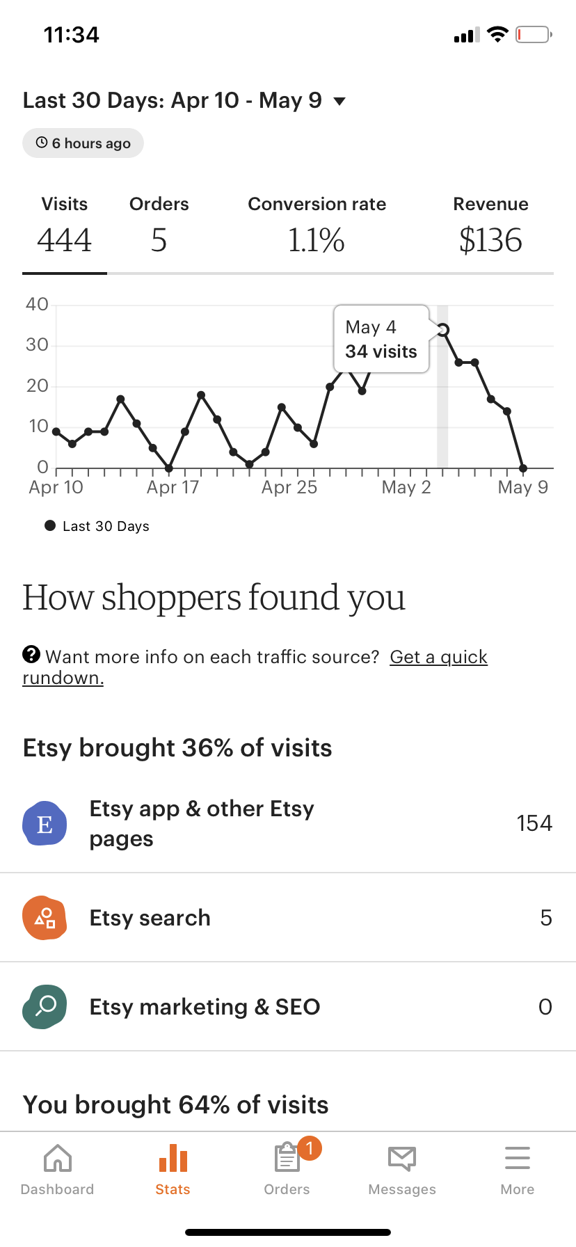
You fill out the required information, apply the categories that you think your product falls into, and hope for the best. Then weeks go by, and you notice you’ve still yet to make a sale — shoot, maybe you’ve yet to even have a visitor. It’s at this point when you take to the google and search “how to get more views to my Etsy store”.
This was what I went through, and this is what this post will be about. I’ll also include a brain dump on how I think I could’ve better improve my product, hardships from running an e-commerce store, and show some data-backed findings. So maybe I’ll just categorize this post as the start of a series on “Brian’s journey through e-commerce”.
Etsy listing optimizations
Today is May 8th, 2020. Last Friday, I wrote down a set of optimization tactics to implement to try and instill some movement in my shop’s rankings.
1. Remove the tag for “mens” from my candles
2. Reduce shipping time
3. Add a 15% off coupon
4. Fill up the photos section of my listings
How I came up with these items was from browsing online blogs as well as analyzing my own store’s data.
- Remove the tag for “mens” from my candles
From looking at the keywords I was ranking for (head to my analytics post to see a table of keywords), I noticed that one set of keywords was bringing in a lot of traffic. “Man candles”. What if I removed the mention of “Men’s candles” from the title of my posts, and instead, replaced it with “candles”. This way, I’d open my listings to include terms that weren’t gender-specific.

For what it's worth, it's not looking good...
- Reduce shipping time
Reducing shipping time was something I picked up from reading an Etsy article. As a consumer, I’d be more inclined to purchase an item that’d ship within two days over an item that’d ship in five. The candle I had set this up for was Sweet.
- Add a 15% off coupon
Adding coupons was a strategy I stumbled upon when browsing competitor shops. I noticed that other shops were offering discounts, so I set to figure out how to do so myself. I added it to the Paradise product, and it raked in a sale. There’s still another week left to fully conclude the coupon’s performance, but I think people are more inclined to buy cheaply priced products.
- Fill up the photos section of my listings
Filling out the number of photos for a listing was also a tip I gathered from an Etsy article. Initially, I thought this was just a ploy that Etsy used to get me to add more photos to enrich their platform at no benefit to my expense. But looking back at my existing listings’ data, the listing that ended up generating a lot of traffic had all of its photo slots filled out. That was more than enough to get me to fill in the photo slots for my other listings.
As for results, I’ll update this post in a week as I’d like more time before making any conclusions.
Optimization Results
So the results are in.
- Remove the tag for “mens” from my candles
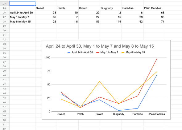
This change produced mixed results. Reason being is that I think my original hypothesis was correct that by changing the focus from “Man candles” to just “Candles”, I’d pull in more views and visits. However, an unintended side effect was that conversions dropped. Within the two week span, I only got 1 order — and that order, in my opinion, wasn’t due to this change. Note that order flow for the 2 weeks prior was at 5.

Etsy listing views from April 24 to May 15.
Due to the more generic keywords, the audience I was bringing in was still too top-of-funnel. What I mean by this is that these viewers were either very much in the exploratory phase of their buyers journey. They are exploring the world of candles, and they are doing so by searching very broad-stroke keywords. Their intent wasn’t to purchase.
Having these premature views resulted in a waste of ad budget as these viewers clicked with very low intent of purchasing.
I’m going to revert this change. I’d rather take on less page general views if that’d mean more targeted visits that are more likely to result in a conversion.
- Reduce shipping time
This was hard to test as there was a drop in conversions. If I was running Etsy, I’d consider having a low turnaround as a parameter I’d reward ranking points for. Not only does this help improve the buying experience, but it also satisfies buyer’s expectation of a quick turnaround.
I’m going to apply this change to all my postings.
- Add a 15% off coupon
I think this strategy worked. I was able to make one sale almost immediately after the coupon campaign started. Like point 2, there wasn’t much conversion data to go off of for me to confirm a conclusive result.
One thing I did notice was that repeated coupon campaigns didn’t result in more sales. Gah. This sucks as I shouldn’t be making this statement without any concrete proof, but my hunch is that coupons can help provide a boost only if you run it once in a blue moon. From a buyer’s perspective, seeing coupons consistently pop up for a shop, instead of a consistent price, raises alarms that a cheap pricing strategy is in place.
Moving forward, I’m going to try and run coupons on the last week of every month.
- Fill up the photos section of my listings
The way I tested this was by having three of the four 4 oz candle listings have filled-up photos, while leaving the last one with only half the photos filled. What resulted was that two of the four 4 oz candle listings (Brown, Burgundy) had a somewhat consistent week-over-week rise in views. The other two (Perch, Sweet) didn’t show much growth.
Then if you look at the Paradise and Plain Candles listings, both showed an increase in views too. Then again, this increase can’t be pinpointed to the addition of photos, rather it could be due to the pivot to a more broad-stroke keyword strategy.
Because Etsy explicitly pushes for photos, I’ll make the effort to fill out the photos section.
That concludes my analyses for 04/24/2020 to 05/15/2020.
Updates and thoughts on 6/27/2020:
I still stand by my conclusions for points 1, 2 and 3. I’m less confident that point 4 is true.
The reason why I don’t think having your entire photos section filled up results in higher ranking boosts is because a lot of top ranking candle listings only have 2 to 4 photos. Maybe the threshold for getting additional ranking points for this parameter is having more than 2 photos.
The first would be a photo of the candle in a living room, the second would be a photo of the candle itself against a white background, and the third would be a photo of the candle and its packaging.
It seems like the mantra of “less is more” takes when it comes to candle photos.
This actually makes it easier on the seller (us). It’s easier to deliver consistency across your listings’ photos if there are only 3 photos you need to maintain across the board.
Working through supply line risks
One thing I went through this past week was having to figure out a way to balance my supply line.
For Etsy, the more listings you have, the more potential you have to bring in additional traffic to your store. However, an increase in listings comes at a cost.
This cost was an increase in up-front supplies to handle the manufacturing for any orders from the newly added product lines. Each additional candle listing resulted in needing three additional 4oz bottles of fragrance oils at hand. To get these new fragrance oil bottles, I’d have to purchase them online and ship them to my place. This meant a large upfront cost that didn’t promise any immediate returns (this might be something to dig into in the future — how to estimate product-market fit for unlisted candles).
Two weeks ago, I added four new listings (Perch, Burgundy, Brown, and Sweet), and the supply costs to serve these 4 new listings would’ve been $120.
This $120 figure was calculated with a couple of assumptions. I averaged out the costs for each 4oz bottle to be $10. Each new candle was a blend of 3 fragrances, so that meant I needed 3 new 4oz fragrance oil bottles per candle. With four new candles, that’d result in a total of 12 new fragrance oil bottles. If you multiplied the variables out, the total would be $120. This was what I had to shell up-front if I wanted to safely add 4 new product listings.
Luckily this build-up has a good ending. The way I went about this supply problem was by utilizing Etsy’s feature of adding the additional processing time to order. I’ve extended the time of arrival for those listings an additional 3 to 5 days out. Hopefully, that’ll be enough of a time buffer to stock on supplies if a new product order comes in.
Creative Packaging
I wanted to refine the unboxing experience for my product. I found this aspect of product formation to be very interesting, and I wanted to explore expressing my creative freedom in this realm. The current experience is a 7x7x7” brown packaging box that’s lightly filled with grey packing paper.

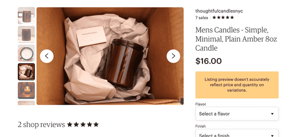
Unboxing photo from listing: Paradise - Pipe Tobacco, Coconut Bourbon, Leather
I thought packing paper was a good starter solution because it was accessible, inexpensive, and recyclable.
I liked the contrast the grey packing paper had against the light brown box. Then in the center was a dark amber glass wedged unto the bed of paper. The whole scene seemed very crisp and clean. I tended to also include a box of white matches with my shipments, and these also meshed well against the neutral tones of the packaging.
I aimed for my packaging to take a background stance while having the core candle product pull in the openers’ attention.
I’ve also been researching and learning how other e-commerce companies curate their unboxing experiences. I’ve been mainly doing this through Lumi’s youtube videos.
One video that made a particular impact was the episode featuring Brooklyn Candle Studio’s candles. I have very high regards for Brooklyn Candle Studio. I love how clean and minimal their designs are. I admire the success they have with their candle subscriptions. If there was a candle company I’d hope to one day be compared with, it’d be them.
From the video, I was able to take away a couple of points that I’d like to instill within my candles’ packaging experience.
-
Give thanks to your customers. Consider including an elegant thank-you letter that’s printed on firm card stock. I liked how they visually structured their card. Their card had a nice rigid balance, and it provided additional opportunities to lead buyers back to their website in case their buyers wanted more info.
-
Consider single-sized candle boxes. Implementing this will help save shipping costs, and offer easier methods of customization (less surface area). From a glance, the 4x4x4” Corrugated Boxes, from Uline, are twice as cheap as the 7x7x7” Corrugated Boxes.
-
Add checkboxes for all candles you list on the box. Then check the one that is actually inside the box. This allows for flexibility in package design as you’ll only need one package design for all your candles. Doing this will also create an opportunity for you to showcase what other candle products your store list.
After watching Brooklyn Candle Studio’s unboxing, I proceeded to watch a couple more unboxing videos to try and see what other strategies I can learn. The below are other points I was able to takeaway:
-
Add in directions on how to use your product.
-
Describe what to do in the before/during/after stages of your product. For example, with candles, the before-stage notes could include instructions to let the candle cure for 2 weeks, the current-stage notes could include trimming your wick before burning, and the after-stage notes could be details on how to remove wax so they can re-use the container.
-
Include other potential swags like stickers and magnets.
-
All parts of the packaging are space that you can communicate your message, showcase your brand, or apply a personalized experience. Four sigmatic’s unboxing video showed how they used the flaps of the box to display a fun message. For Function of Beauty’s unboxing video, they stickered the box together with a sticker that had the receiver’s name. I thought that was pretty cool.